Hyperrhiz 13
Data Visualization
Helen J. Burgess
North Carolina State University
Citation: Burgess, Helen J.. “Data Visualization.” Hyperrhiz: New Media Cultures, no. 13, 2015. doi:10.20415/hyp/013.i03
Abstract: this narrative documents the process of producing a “data gnome” object for Hyperrhiz 13, using components from the Duke University S-1 Speculative Sensation Lab, and built on network data collected while editing the issue for publication.
 Hyperrhiz Data Gnome Process for Issue 13
One of the great pleasures in producing this issue on kits has been having the chance to "clown around" (as Craig Saper and Lynn Tomlinson would say) with the other authors' kits in the collection. My attention was particularly drawn to the Manifest Data project by Duke's S-1 Speculative Sensation Lab, which assembles multiple media objects, including maps, meshes, augmented reality images and a real, sculpted garden gnome at the end of the process. Challenge accepted.
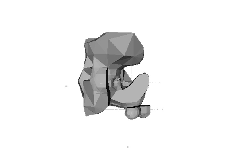
The images and objects on this page were produced using the Manifest Data kit, and represent the network data collected from my laptop while producing Hyperrhiz 13. Presumably some of this data was collected while I worked on the Manifest Data kit itself, which means it's quite possibly gnomes all the way down: a meta-creation if there ever was one.
A couple of observations: first, I was initially a little disappointed with the "shape" of my data object, which seemed (compared to the wonderful shapes produced by members of the lab that reminded me of snowflakes, cosmic holes and liquid impacts) sedate, inactive even. It's a relatively smooth and contained-looking object, outside of the intriguing floating "peanut" that appears on one face. And yet — it's clearly a revealing rendering of the editorial process, which is often constituted by obsessive, introspective activity as the editor attempts to shape disparate works into a coherent whole for the world to see.
But second — that peanut. Looking at the data map, the first step in the visualization process, I was interested to see the octopus nature of my activity as it passed outside of the bounds of my localized activity in the United States. As I worked, I "touched" other continents, a kind of passing through the leaky boundary of a national network. We all know from email headers that our activity can easily jump all over the globe as it is shuttled from one server to another, but it's surprising to see it visualized so... literally. I don't know for sure, but I like to think that the peanut is the result of those momentary international excursions. I know for sure one of them was me hitting a Chinese server to see if the Back Dorm Boys still existed (they do).
It's not often that an editor of an electronic collection is able to receive such an embodied, concrete (literally!) manifestation of his or her activity. This data will be soon turned into a 3-D printed object, and after that be incorporated into a data gnome for permanent display, at which time I'll post pictures here. In the meantime, though, I offer a map, a 2-D mesh, and a 3-D rendering of our very own data shape. Many thanks to Amanda Starling Gould, Luke Caldwell, libi rose striegl, Shane Denson, Karin Denson, and David Rambo for enabling Hyperrhiz to participate in the world of data shapes and data gnomes.
Data Map from TCPFlow
Meshlab Model